Just as your marketing strategies should be sharp and engaging, so too should your understanding of design. Mastering these graphic design principles can greatly enhance your visual communications, boost brand recognition, and ultimately drive more conversions. In this post, you’ll discover the necessary design rules that will not only elevate your campaigns but also empower you to communicate your message effectively. Let’s investigate the ten principles that every marketer should have in their toolkit.
Contrast
Before plunging into the world of graphic design, it’s vital to grasp the concept of contrast. This principle serves as a foundational element that can make or break your marketing materials. By effectively utilizing contrast, you can enhance the visual appeal of your graphics while ensuring that your message stands out.
Visual differentiation
An important aspect of contrast is visual differentiation. By juxtaposing different elements, such as colors, sizes, and shapes, you create a dynamic interplay that draws the viewer’s attention. When you use contrasting colors, for instance, you can highlight key information or relevant calls-to-action, guiding your audience’s focus to what matters most. Whether you’re aiming to differentiate headings from body text or establish a hierarchy in your design, contrast is your ally in achieving visual clarity.
Clear communication
For effective marketing, clear communication is important, and contrast plays a pivotal role in this. By ensuring a strong contrast between your text and background, you eliminate the risk of confusion and enhance readability. When your audience can easily read your message, they’re more likely to engage with your content. For example, using dark text on a light background, or vice versa, ensures that your audience doesn’t strain to decipher your messages, which can be especially detrimental in a crowded marketplace.
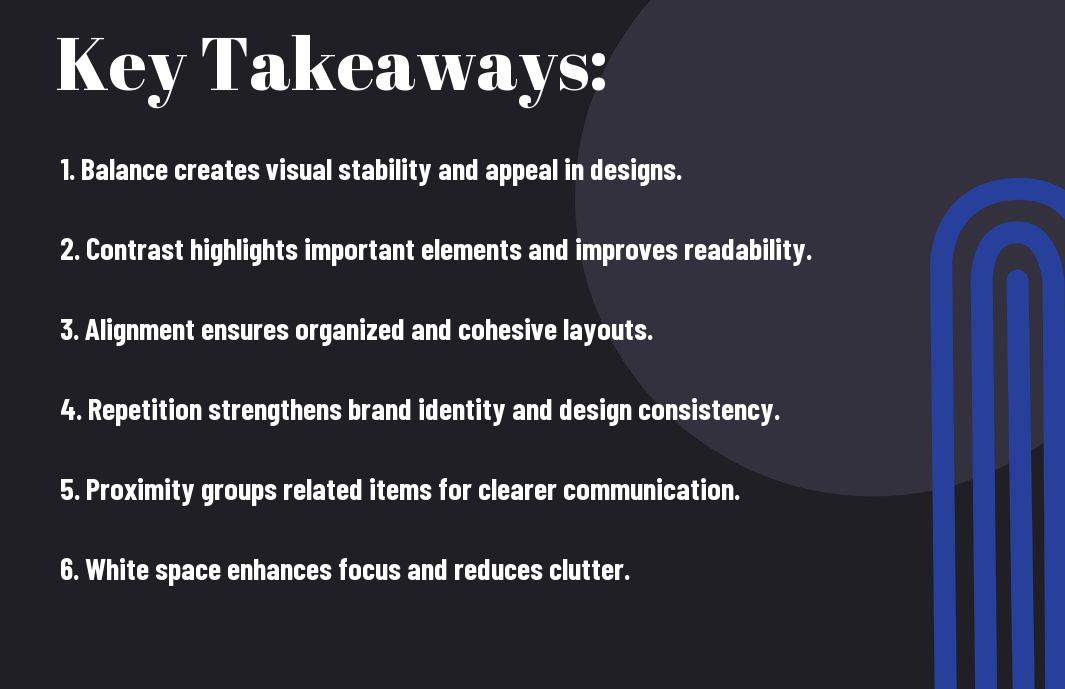
Contrast is about more than just aesthetics; it strengthens your overall message. It allows you to convey urgency or importance by manipulating the visual weight of your components. You can emphasize certain elements by using bolder colors or larger fonts, ensuring that your audience recognizes their significance. By mastering contrast, you can guide your viewer’s journey effectively, making every piece of your marketing collateral more impactful.
Alignment
If you want your designs to be effective and communicate your message clearly, understanding alignment is imperative. Alignment refers to the way elements are arranged in a design to create a sense of order and organization. When objects are aligned, they create a visual connection that helps to guide the viewer’s eye throughout your design, making it easier for them to process the information presented.
Organized Layout
Even a small misalignment in your design can lead to confusion and an unprofessional appearance. A well-organized layout helps to establish clear relationships between different elements, such as images, text, and calls to action. When you ensure that elements are properly aligned, you create a cohesive look that draws attention to the most important parts of your design, allowing viewers to engage with your content more thoughtfully.
As you create layouts, consider using grids or guides to facilitate alignment. Keeping margins and spacing consistent will not only improve the overall aesthetic but also enhance readability, leading to a better user experience. In marketing, a clean and organized layout can help your message resonate more effectively with your audience and bolster your brand’s credibility.
Visual Hierarchy
Organized designs naturally lead to a strong visual hierarchy. In web and graphic design, visual hierarchy refers to the arrangement and presentation of elements in a way that signifies their importance. When you create a clear hierarchy, you help viewers quickly understand where to focus their attention, guiding them through your content in a logical sequence.
It is imperative to vary font sizes, colors, and styles to create distinct points of emphasis in your design. By using larger fonts for headlines and smaller ones for body text, you establish a clear hierarchy that allows users to digest information more easily. Likewise, contrasting colors can draw attention to critical elements, such as calls to action or key messages. By taking the time to establish a thoughtful visual hierarchy, you enhance your audience’s experience and increase the chances of them taking the desired action.

Repetition
The principle of repetition in graphic design is all about creating a sense of cohesion and unity within your marketing materials. By consistently using specific elements such as colors, fonts, and imagery, you can create a recognizable aesthetic that helps reinforce your brand message. This principle not only enhances the visual appeal of your designs but also helps to solidify your brand identity in the minds of your audience. You want your marketing efforts to stand out, and repetition enables you to achieve that memorability.
Consistent themes
Some marketers may underestimate the power of consistent themes in their designs. When you adopt a unified style across various platforms—be it your website, social media profiles, or email campaigns—you are vitally laying the groundwork for a recognizable brand image. Utilizing the same visual motifs, such as logo placement and typography, allows your audience to immediately connect your designs with your brand, facilitating stronger engagement.
Incorporating consistent imagery and layout elements also gives your marketing materials a polished and professional appearance. You are more likely to build trust with potential customers when they see that you take your branding seriously and present a coherent visual narrative across different channels.
Brand recognition
Now, let’s research into the power of brand recognition through repetition in graphic design. The more you consistently present your brand’s visual elements, the easier it is for your audience to identify your brand, even when they encounter it amidst a sea of competitors. When your materials look strikingly similar across all marketing channels, you can create pathways for your audience to remember your brand. This familiarity can lead to increased customer loyalty and ultimately drive sales.
It is vital to understand that strong brand recognition can significantly impact your overall marketing strategy. When your brand is consistently represented, it forms a lasting impression in the minds of consumers. This not only makes it easier for them to recall your brand but also builds a sense of credibility and reliability, increasing the chances that they will choose your products or services over others. Always focus on maintaining visual consistency to cultivate robust brand recognition and foster a loyal customer base.
Balance
After mastering the fundamentals of graphic design, one of the key principles that can elevate your marketing efforts is balance. Balance refers to the visual stability and distribution of elements within a design, ensuring that no one part overwhelms another. When your design achieves a sense of balance, it feels harmonious and creates a better experience for your audience, ultimately enhancing the effectiveness of your message.
Visual Stability
With balance, you create a design that feels coherent and stable. Visual stability is achieved through the careful arrangement of elements such as text, images, and colors in a way that leads the viewer’s eye smoothly across the composition. A well-balanced design can guide your audience’s attention where it is needed most, making it easier for them to engage with your content.
Symmetry or Asymmetry
Even though symmetry often evokes feelings of order and professionalism, asymmetry can inject energy and dynamism into your design. When deciding between these two approaches, consider the message you want to convey. A symmetrical layout is often used in more traditional or formal contexts, while an asymmetrical arrangement can convey creativity and modernity, appealing to a more dynamic audience.
This flexibility in utilizing symmetry and asymmetry allows you to tailor your designs to fit specific themes or campaigns. While symmetry can provide a sense of calm and predictability, asymmetry introduces movement and excitement, engaging your viewers in unexpected ways. Understanding when and how to use each type of balance can significantly impact the effectiveness of your marketing materials. Always strive for a balance that aligns with your brand message while keeping your audience engaged and intrigued.
White Space
Many marketers overlook the significance of white space in graphic design. White space, also known as negative space, refers to the empty areas that surround and separate different elements of your design. This space is not merely a blank canvas; it plays a vital role in creating a balanced and aesthetically pleasing layout that can greatly impact your marketing materials. By understanding how to effectively incorporate white space, you can enhance readability and make your content more engaging for your audience.
Breathing Room
One fundamental aspect of using white space is the concept of breathing room. When you provide ample white space around text and images, you help guide the viewer’s eyes to the most important areas of your design. This breathing room allows each element to stand out without competing for attention, ultimately improving clarity. If your designs feel cramped, viewers may become overwhelmed and miss the message you’re trying to communicate.
Enhanced Focus
Space is also instrumental in enhancing focus. By incorporating sufficient white space in your layouts, you can direct your audience’s attention to specific elements or calls to action. This strategic placement effectively minimizes distractions, allowing viewers to absorb your message more readily. When they concentrate on what truly matters, your marketing initiatives have a higher chance of success, whether that involves encouraging a purchase, signing up for a newsletter, or engaging with your brand.
A well-executed design that utilizes white space enhances the viewer’s journey, allowing them to navigate through your content effortlessly. In a world where consumers are constantly bombarded with information, creating a visual hierarchy using white space can demand attention and lead to more significant engagement results. You should leverage this principle to ensure that your designs are effective, appealing, and capable of delivering their intended message.
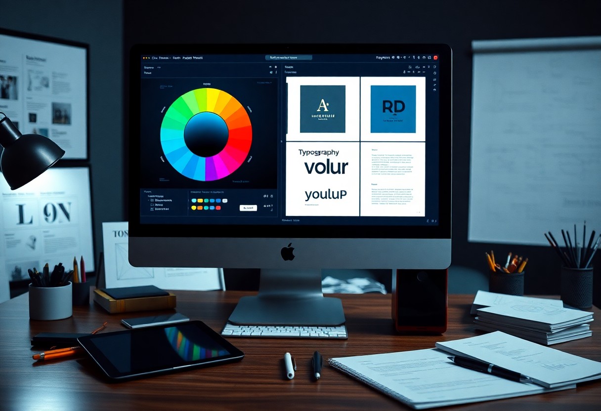
Color Theory
Keep in mind that color theory plays a vital role in your marketing materials. As a marketer, understanding how colors influence perception and behavior can help you create more effective campaigns. Different colors evoke various emotions and reactions, and by strategically utilizing them, you can enhance your messaging and engage your audience more effectively.
Emotional Impact
An important aspect of color theory is the emotional impact colors have on your audience. For example, red can evoke feelings of excitement and urgency, which makes it an excellent choice for sales promotions. In contrast, blue often conveys trust and dependability, making it a preferred color for financial institutions. By selecting colors that align with the emotions you want to elicit, you can foster a stronger connection with your target market.
Furthermore, the cultural context of color plays a significant role in how it’s perceived. While white is often associated with purity and peace in Western cultures, it can symbolize mourning in some Eastern cultures. As you create your marketing materials, be mindful of the cultural significance of the colors you choose to ensure they resonate positively with your audience.
Brand Identity
Theory plays a considerable part in developing a cohesive brand identity. The colors you select become recognizable aspects of your brand’s personality. Using a consistent color palette enhances the recognizability of your brand, helping you stand out in a crowded market. Each color conveys unique messages about your brand values and purpose, so choosing the right combination is crucial for creating a strong brand presence.
Plus, a well-thought-out color scheme can differentiate your business from competitors and support brand loyalty. By consistently applying your chosen colors across different marketing channels—whether in social media graphics, website design, or print materials—you reinforce your identity in the minds of your audience. Establishing a strong visual representation through color helps ensure your brand is instantly recognizable and linked to the specific emotions and ideals you wish to convey.
Typography
Your choice of typography can significantly impact the effectiveness of your marketing materials. Typography establishes the tone of your messaging and guides your audience’s reading experience. Selecting the right fonts does not merely concern aesthetics; it influences how your message is perceived and absorbed. A well-thought-out typography strategy can enhance readability, strengthen branding, and facilitate better engagement with your content.
Readable fonts
Assuming your audience may be reading on a variety of devices—each with different screen sizes—you must prioritize readability. Choose fonts that are easy to read at various sizes and across different backgrounds. Sans-serif fonts, such as Arial or Helvetica, tend to provide excellent clarity, making them suitable for digital content. They are especially useful for headlines and body text to ensure your message remains accessible.
By using adequate line spacing and font size—ideally 16px or larger—you can significantly improve readability. Additionally, make sure to avoid overly decorative fonts for body text, as they can distract or confuse your audience. The intention is clear communication. Always test your designs to understand how your target audience is experiencing your typography.
Appropriate styles
On top of focusing on readability, you should also consider the overall style of your typography. Each font has its own personality; some evoke a sense of modernity while others carry a classic or traditional flair. Choosing appropriate styles ensures that your typography aligns with your brand image and resonates with your audience. For instance, using a playful font for a children’s brand can convey a sense of fun and creativity, while a sleek, minimalist font might be more suitable for a high-end product.
You can enhance your brand message by selecting font styles that reflect your company’s values and target market. Think about the emotion you want to convey and choose typography accordingly. Using a mix of font weights and sizes can help establish a hierarchy in your layout, guiding your audience’s attention where it needs to go. Ultimately, your goal should be to create a seamless visual experience that supports your marketing objectives and engages your audience effectively.
Imagery
Now, when it comes to graphic design, imagery plays a fundamental role in how your message is perceived. The visuals you choose can evoke emotions and engage your audience on a deeper level. Therefore, it’s imperative that you consider both the content and the relevance of the images you use. Effective imagery not only attracts attention but also helps communicate your brand’s identity and values, making it imperative to align your visuals closely with your overall marketing goals.
Relevant visuals
Imagery should always be relevant to your content and your audience’s interests. When you select visuals that reflect your message or the emotions you want to convey, you enhance the likelihood that your audience will connect with your brand. For instance, if you’re promoting a wellness product, choose images that depict relaxation, health, and vitality, steering clear of visuals that may not resonate with the essence of your brand message. By ensuring your visuals are pertinent, you establish credibility and build trust with your audience.
Quality pictures
Relevant visuals are only effective when they are of high quality. With the proliferation of smartphones and cameras, high-resolution images are more accessible than ever, but not all photos meet the mark. Using pixelated or poorly lit images can diminish your brand’s professionalism and distract from your message. Therefore, always opt for images that are well-composed and visually appealing. High-quality pictures can significantly elevate your marketing materials and ensure that your audience takes your content seriously.
With quality pictures, you not only enhance the visual appeal of your marketing efforts but also reinforce your brand’s reputation. Investing in professional photography or high-quality stock images can make a substantial difference in how your audience perceives your brand. Good visuals draw the viewer in, encouraging longer engagement with your content, which is vital for conversions and building a loyal customer base. If you’re using images in your campaigns, strive for those that embody excellence in both clarity and composition.
User Experience
To create an effective marketing campaign, understanding user experience (UX) is necessary. UX design focuses on optimizing how individuals interact with your brand, whether through a website, app, or other digital platforms. By prioritizing the user experience, you can foster a deeper connection with your audience and improve overall engagement, leading to increased conversions and brand loyalty.
Navigation Ease
Assuming you want your audience to easily access information, a seamless navigation structure is key. By organizing your content intuitively, you allow users to find what they’re looking for without frustration. Use clear labels for your navigation menus, and ensure that important pages are just a click away. Keep in mind that visitors should never feel lost; your aim is to guide them effortlessly through their journey on your site.
Additionally, incorporating a search feature can significantly enhance navigation ease. This allows users to quickly locate specific information, reducing the time they spend browsing your site. As you design, conduct user testing to gather feedback on your navigation elements, making adjustments to ensure a frictionless experience that caters to your audience’s needs.
Accessibility Considerations
Any successful marketing strategy includes accessibility considerations to ensure your content is inclusive for all users. This means your design should accommodate individuals with disabilities, such as visual impairments or other limitations. Use high-contrast colors for text and backgrounds, include alt text for images, and ensure that your website is navigable through keyboard shortcuts. By doing so, you make your content accessible to a wider audience, which enhances overall user satisfaction and encourages engagement.
It is necessary to assess your website’s accessibility using tools and guidelines, such as the WCAG (Web Content Accessibility Guidelines). By following these standards, you’re not only meeting legal obligations but also positioning your brand as a leader in inclusivity. Providing a positive experience for all users demonstrates your commitment to accessibility, which can significantly boost your brand’s reputation.
Visual Storytelling
For marketers, mastering the art of visual storytelling is crucial to crafting compelling narratives that resonate with your target audience. By combining visual elements with an engaging storyline, you can effectively communicate your brand’s message and values, making it easier for potential customers to connect with what you offer. This powerful combination can not only capture attention but also elicit emotions and drive deeper understanding of your brand’s purpose.
Engaging Narratives
One effective way to harness the power of visual storytelling is through engaging narratives that draw your audience into a story. Whether it’s creating a captivating infographic, a dynamic slideshow, or an eye-catching video, your goal should be to take your viewers on a journey that unfolds through visuals. Align your graphics with a storyline that unfolds incrementally, allowing the audience to feel a sense of progression and emotional investment in what they are viewing. This approach encourages them to stay involved and curious, driving them toward your desired action.
Audience Connection
Visual storytelling excels in establishing a connection with your audience by tapping into their emotions and experiences. When you allow your visuals to convey a message that resonates personally, you make it more likely that your audience will engage with and share your content. Visuals can evoke feelings like nostalgia, joy, or even empathy, turning passive viewers into active participants in your brand’s narrative.
A strong audience connection is built when you understand their emotions and values. Each visual element in your storytelling should intentionally relate back to your audience’s interests and aspirations. By highlighting relatable moments, you make your graphics more impactful and relevant. Integrate elements that express your audience’s experiences and challenges to reinforce why your brand matters in their lives. The more relatable your visuals are, the more likely your audience is to form a lasting bond with your brand, turning to you as a trusted source.
Conclusion
So, by mastering these 10 graphic design principles, you can elevate your marketing efforts and make a lasting impact on your target audience. Understanding concepts like balance, alignment, contrast, and hierarchy will empower you to create visually engaging materials that effectively communicate your brand message. Implementing these principles in your projects not only enhances the overall aesthetics but also improves the usability and functionality of your designs, making your campaigns more effective.
As you continue to apply these design principles, you’ll notice how they influence your marketing strategies, allowing you to create more compelling content that resonates with your audience. Whether you’re designing social media graphics, website layouts, or promotional materials, integrating these principles will provide you with the foundation needed to craft visually appealing and functional designs that stand out in today’s competitive marketplace. Your journey toward becoming a more effective marketer begins with understanding and applying these necessary graphic design principles.