Essential web design principles endure because they prioritize clarity, accessibility, and performance; when you apply timeless layouts, clear typography, deliberate spacing, and responsive patterns, your site remains usable and persuasive across devices and trends.
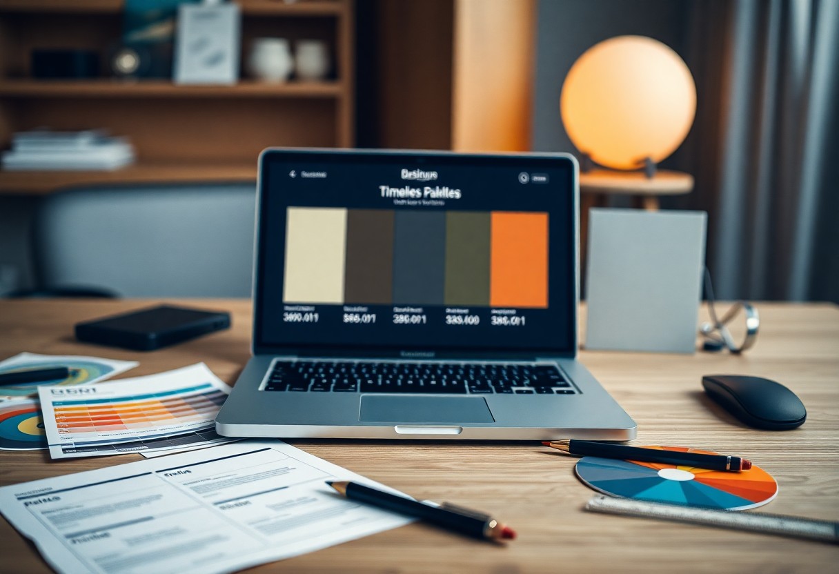
Timeless Color Palettes
Timeless palettes anchor your interface by favoring neutrals, restrained accents, and consistency; aim for 3-5 hues and apply the 60-30-10 rule (60% dominant, 30% secondary, 10% accent) to maintain hierarchy. Brands like Apple and Aesop use largely neutral systems that scale across products, while Pantone trends inform seasonal accents. You should prioritize WCAG contrast targets and test palettes in both light and dark modes to ensure longevity.
Monochromatic Schemes
Using tints and shades of a single hue gives you visual harmony and speeds decisions for UI components; pick 4-6 tonal steps and assign them to backgrounds, surfaces, text, and accents. You can emulate Medium’s greyscale reading experience or IBM’s restrained blues to keep focus on content, and you should verify legibility at normal text sizes using a 4.5:1 contrast minimum.
Bold Contrasts
High-contrast pairings make CTAs and key information pop; combine complementary or triadic colors and reserve saturated tones for 10-20% of the layout so you don’t overwhelm users. Examples include Spotify’s black/green and Target’s red/white identity-both use stark contrast to drive attention. Always confirm at least 4.5:1 contrast for body text and 3:1 for large text per WCAG 2.1.
For implementation, desaturate backgrounds to boost perceived contrast, add subtle shadows or outlines to separate elements, and test with WebAIM Contrast Checker and ColorOracle for color-blind simulations. In several A/B studies, pages using bold contrast for primary CTAs saw 20-30% higher click-through; balance vivid hues with neutral spacing to maintain readability across devices and ambient lighting.
Responsive Design
You must make layouts adapt across devices because around 60% of web sessions come from mobile; that means flexible typography, responsive images (srcset/sizes), and CSS Grid/Flexbox for layout control. Use breakpoints like 360px, 768px, and 1024px, optimize assets for each viewport, and test real-world devices or emulators so your interface stays usable and fast whether a user is on a 4.7″ phone or a 27″ monitor.
Fluid Grids
Adopt percentage-based columns and a 12-column system (Bootstrap-style) to scale components smoothly; set max-widths around 1200-1440px and gutters of 16-24px. Combine CSS Grid for complex arrangements and Flexbox for component-level alignment, use calc() and clamp() to keep sizes proportional, and prioritize content flow so elements reorder naturally without breaking at common breakpoints.
Mobile-First Approach
Start design and CSS at the smallest viewport-typically 360px-and progressively enhance up to tablet/desktop, focusing on performance and touch ergonomics: use 48px touch targets, responsive images, and lazy loading to hit Core Web Vitals targets (LCP <2.5s, FID <100ms, CLS <0.1); Google indexes mobile-first, so your mobile experience determines search visibility.
Practically, build with min-width media queries (480px, 768px, 1024px), inline critical CSS for faster first paint, and defer nonimperative JS. Measure with Lighthouse and set performance goals (score >90). Employ feature queries and container queries for progressive enhancement, and optimize images with AVIF/WebP plus srcset to reduce payloads and improve both speed and conversion on handheld devices.
Typography Trends
Type shapes define hierarchy and tone, so you should prioritize legibility and performance: a 16px base with 1.5 line-height, WCAG 2.1 contrast of 4.5:1 for body copy, and a modular scale (1.25) for consistent heading sizes. Variable fonts let you combine multiple weights while reducing HTTP requests, and Google Fonts like Inter or Roboto remain reliable choices for cross-platform consistency.
Clean and Readable Fonts
You should favor neutral, high x-height sans-serifs such as Inter, Roboto, or system stacks (-apple-system, BlinkMacSystemFont, “Segoe UI”) for body text; they improve readability at small sizes and on mobile. Apply responsive sizing (clamp()), maintain 1.4-1.6 line-height, and ensure color contrast meets 4.5:1 to keep your content accessible and scannable across devices.
Creative Font Pairings
You can create personality by pairing a distinctive display or serif for headings with a restrained sans for body text; classic combos include Playfair Display + Montserrat, Merriweather + Open Sans, or Roboto Slab + Roboto. Limit families to two, use weight and size contrast for hierarchy, and test pairings at 320px and 1440px to verify harmony and legibility.
When refining pairings, check x-height, stroke contrast, and letterspacing so the mood aligns-serif headlines convey tradition while geometric sans feel modern. Avoid pairing fonts with similar skeletons, preload your key fonts and use font-display: swap to prevent FOIT, and aim to keep total font payload under ~200KB or use variable fonts to reduce weight while preserving multiple styles.
Minimalism
You strip interfaces down to importants so users act faster and content reads clearer; design systems like Material use an 8pt grid to enforce consistent spacing and Apple’s product pages demonstrate how bold imagery plus sparse copy can boost engagement. By reducing choices and visual noise you often see conversion lifts of 10-30% in A/B tests, especially when CTAs, typography, and imagery are prioritized over decorative elements.
White Space Utilization
White space functions as a directional tool you use to create hierarchy and improve legibility; apply 16-32px gutters on mobile and 24-48px on desktop while keeping line-height around 1.4-1.6 for body text. Using an 8pt spacing scale makes margins predictable across breakpoints, and examples like Medium show that generous margins increase dwell time and reading completion rates.
Simple Navigation
You limit top-level links to 5-7 clear labels, place primary actions prominently, and provide a persistent search for complex sites; breadcrumbs and a sticky header reduce user friction. When you test, focus on first-click accuracy and keep iconography descriptive-Airbnb and Dropbox use concise headings plus single-line CTAs to guide users quickly to tasks.
You prioritize core user journeys by hiding secondary actions under “More” menus or the footer and using progressive disclosure for advanced options. On mobile prefer a bottom nav or labeled hamburger with 3-5 items, and validate choices with tree testing and card sorting; measure success via task completion rate, time on task, and reduced bounce to iterate efficiently.
User Experience (UX) Focus
Prioritize seamless flows so you reduce friction and improve conversions: optimize load times (Google finds 53% of mobile visits abandon after 3 seconds), ensure WCAG contrast and keyboard access, and measure with task completion rates and SUS scores. You should combine performance budgets, clear information architecture, and microcopy that guides decisions to keep bounce rates low and engagement high.
Intuitive Interfaces
Apply Hick’s and Fitts’s laws to simplify choices and size targets – aim for 3-5 primary actions per screen and large tappable areas (44-48px) for mobile. You should rely on predictable patterns, consistent affordances, and an 8pt grid to align elements; familiar components like tab bars and floating action buttons reduce learning time and boost task completion.
Engagement through Interaction
Use microinteractions and motion to provide immediate feedback: respond within 100ms for perceived instantness, animate state changes at ~200-400ms, and prefer subtle easing. You should leverage hover, tap, and progress feedback to confirm actions, guide attention, and make flows feel alive without hurting performance or accessibility.
When refining interactions, A/B test microcopy and animation timing; small tweaks often lift engagement. Keep animations GPU-accelerated (transform/opacity) to maintain 60fps (≈16ms per frame), respect reduced-motion settings, and measure via task success, time-on-task, and conversion lift to ensure interactions help, not hinder, your goals.
Use of Imagery
Imagery directs attention and sets tone; when you pair full-bleed hero images with concise CTAs, A/B tests from companies like Shopify and Airbnb report 5-20% uplifts in engagement. Use WebP or AVIF for faster loads, supply srcset with 1x/2x variants, and keep hero assets around 200-300 KB. Prioritize focal-point cropping, descriptive alt text for SEO, and lazy-load below-the-fold visuals to maintain performance budgets.
High-Quality Photography
Choose images at 1200-1920 px widths, provide 2x retina sources, and aim for 70-80% JPEG compression or WebP equivalents to balance clarity and size. You should standardize color grading and consistent lighting; Apple-style product shots use neutral backgrounds and 3-5 directional lights to communicate detail. Always credit photographers and archive originals for reuse.
Video Backgrounds
Use short loops of 5-15 seconds, muted and autoplayed, with a static poster fallback for slow connections. Keep encoded files around or under ~1 MB for initial load, provide WebM + MP4 to cover browsers, and ensure videos are contextually relevant-irrelevant motion can raise bounce rates. Autoplay will require the video to be muted to comply with browser policies.
When you implement videos, include playsinline, muted, loop, autoplay and preload=”metadata”, and apply CSS object-fit: cover with object-position to preserve focal points. Respect prefers-reduced-motion and the Save-Data header by serving the poster image or skipping autoplay; lazy-load video elements and initialize playback only on viewports wider than 768 px or when navigator.connection.effectiveType === ‘4g’ to protect bandwidth and UX.
Summing up
Summing up, you should focus on clarity, usability, and responsiveness to ensure your sites remain effective; prioritize accessible typography, fast performance, consistent branding, intuitive navigation, well-chosen imagery, and generous whitespace so your designs stay relevant and easy to use across devices and audiences.