Many aspiring brands fall into common graphic design traps that can undermine their identity and effectiveness. As you build your brand, it’s crucial to recognize these pitfalls to create a cohesive and memorable visual presence. From inconsistent color schemes to poorly chosen fonts, these design missteps can detract from your message and hinder audience engagement. This post will outline key graphic design mistakes you should avoid to ensure your brand identity stands out for the right reasons.
Understanding Brand Identity
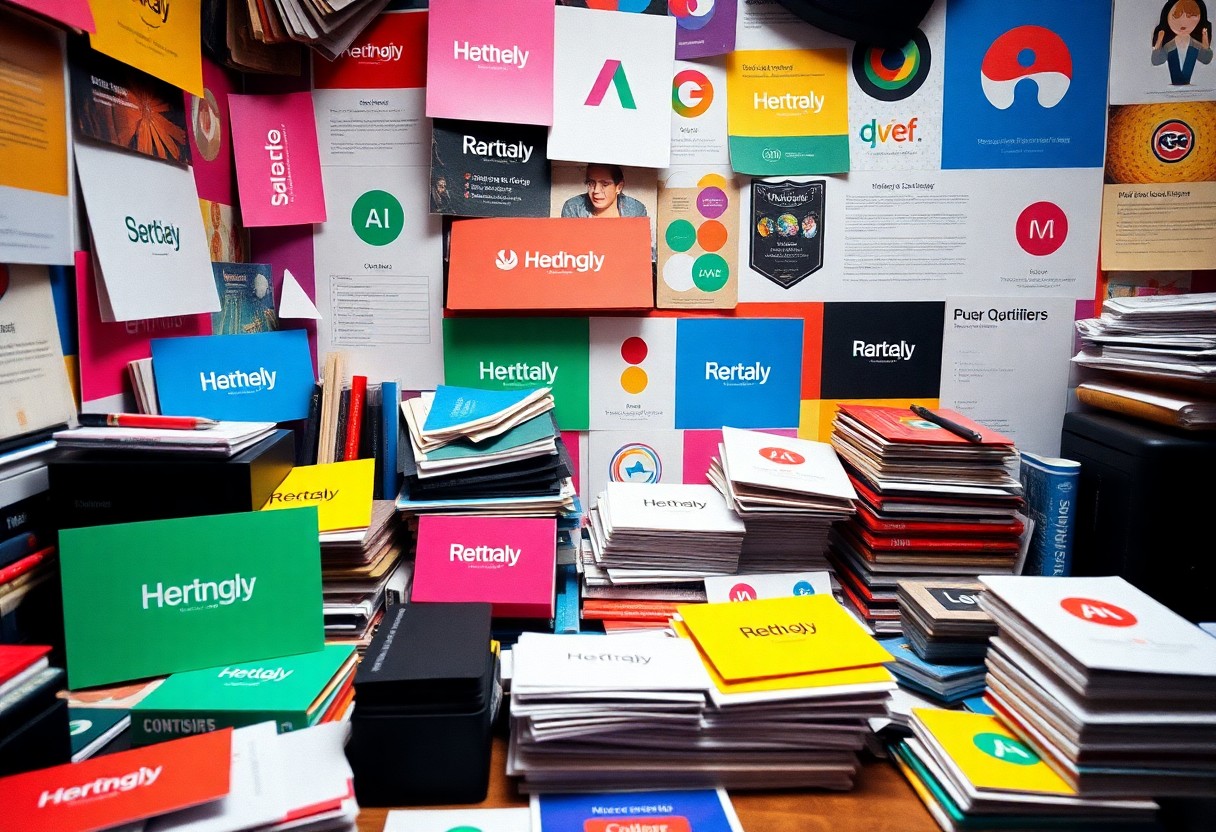
Your brand identity encompasses the visual elements that communicate your brand’s essence, including your logo, color palette, typography, and overall design style. It is the perception that shapes how your audience views your business. Crafting a cohesive brand identity helps establish trust and recognition, crucial for standing out in a crowded market.
The Importance of Visual Consistency
How Brand Identity Affects Perception
Your brand identity directly influences consumer perception and can dictate their decision-making process. A well-crafted identity conveys professionalism and reliability, while inconsistency can lead to confusion and skepticism from potential customers.
Common Graphic Design Mistakes
Many brands inadvertently make graphic design missteps that detract from their identity. Identifying and avoiding these pitfalls can significantly enhance your brand’s visual appeal and coherence. Let’s examine two frequent mistakes that can derail your branding efforts.
Overcomplicating Designs
Simplicity is often key in design. When you overcomplicate your visuals with excessive elements, colors, or fonts, you risk confusing your audience. Aim for clarity by focusing on a cohesive design that communicates your message effectively without unnecessary distractions.
Ignoring Brand Guidelines
Establishing and adhering to your brand guidelines ensures consistency across all visual elements. This includes color palettes, typography, and logo usage. Deviating from these guidelines can dilute your brand identity and confuse your audience. A study found that consistent branding can increase revenue by up to 23%. Therefore, investing the time to create and implement comprehensive brand guidelines pays off significantly in solidifying your brand’s presence.
Misusing Color Psychology
Color plays a vital role in shaping perceptions of your brand. When misused, it can lead to confusion, alienation, or even offense. Understanding the psychological impact of colors allows you to connect with your target audience effectively while reinforcing your brand values. Your choices in color shouldn’t be arbitrary; instead, they should be strategic and informed by research and emotional resonance.
Choosing Inappropriate Color Schemes
Your color scheme should align with your brand message and target audience. A mismatch between colors and your brand identity can create a dissonance that erodes trust. For example, if you run a healthcare brand and use bright, playful colors, it may undermine your professionalism. Aim for a scheme that reflects your brand values and resonates emotionally with your audience.
Neglecting Cultural Associations
Ignoring cultural context when selecting colors can result in unintended associations that harm your brand. Colors can have vastly different meanings across cultures. For instance, while white signifies purity in Western cultures, it symbolizes mourning in some Eastern cultures. If you’re targeting a global audience, it’s vital to research color symbolism relevant to specific demographics to avoid miscommunication and offense.
The impact of cultural associations extends beyond mere aesthetics; it influences how your brand is perceived and can dictate its success in various markets. For example, the color red can evoke passion and excitement in some cultures, while in others, it may denote danger or caution. If your brand relies on international appeal, employing a universal design approach—while being mindful of regional differences—is key. Conduct surveys or focus groups with your target demographic from different cultural backgrounds to ensure that your choices resonate positively and lay the groundwork for a strong, inclusive brand identity.
Typography Errors
Typography plays a pivotal role in brand identity, yet many brands overlook its significance. Mistakes in typography can lead to confusion, misinterpretation, and a disjointed image. By addressing common typography errors, you can enhance your brand’s readability and appeal.
Inconsistent Font Usage
Inconsistent font usage can dilute your brand’s message and confuse your audience. Sticking to a limited selection of fonts creates unity across your materials, establishing a recognizable identity. Ideally, choose no more than three fonts—one for headings, one for body text, and one for accents—to maintain coherence.
Legibility Issues
Legibility is vital to effective communication in your branding. Choosing overly stylized or small fonts can make it difficult for your audience to read your message. When dicking out fonts, keep in mind the context in which they will be used and test them in various sizes and formats to ensure clarity.
Several studies suggest that legible typography enhances user experience and retention. For instance, the average reader’s eye can comfortably parse text at a size of 10 to 12 points for print and even larger for digital screens. High-contrast color combinations can also significantly affect legibility; for example, black text on a white background is universally recognized as easier to read. Testing your designs with actual audience feedback helps identify potential issues before finalizing your materials.
Poor Image Quality
Using low-quality images can undermine your brand’s credibility and professionalism. Blurry or pixelated visuals not only distract but also convey a lack of attention to detail. When potential customers encounter poor image quality, they may question the reliability of your brand. Invest in high-resolution images that reflect your brand’s values and enhance your overall identity.
The Impact of Low-Resolution Images
Low-resolution images can distort your brand message and create a negative impression. Studies show that consumers are less likely to trust brands that appear unprofessional due to shoddy visuals. This mistrust can lead to reduced engagement and lower conversion rates, ultimately affecting your bottom line.
Choosing the Right Images for Your Brand
Selecting the right images involves understanding your brand’s story and the emotions you wish to evoke. Utilize visuals that resonate with your target audience and align with your overall messaging. Consider using original photography or high-quality stock images that embody the essence of your brand.
Choosing the right images means more than just aesthetics; it’s about reinforcing your brand identity. Aim for consistency in style, color palette, and subject matter across all visual content. For instance, if your brand is known for a minimalist aesthetic, ensure that your images reflect this clean approach. Research shows that brands that maintain visual consistency can increase brand recognition by up to 80%. Tailor your image selection to appeal directly to your target demographic, utilizing visuals that speak to their preferences and aspirations. This targeted approach elevates your brand presence and fosters a deeper emotional connection with your audience.
Neglecting Audience Engagement
Engaging your audience in the design process is vital for building a brand identity that resonates. Overlooking this aspect can result in a disconnect between your brand and the very people you aim to attract. Successful brands actively listen and adapt their visuals based on audience interaction, fostering loyalty and trust. This two-way communication not only strengthens your identity but also invites your audience to become advocates for your brand.
Failing to Consider Your Target Audience
Your target audience shapes every part of your branding, including design choices. Ignoring their preferences can lead to ineffective or even off-putting visuals. Conducting audience research helps you understand their tastes and values, ensuring your design aligns with their expectations and creating a more engaging experience.
Ignoring Feedback and Adaptation
Feedback is a powerful tool that many brands undervalue. By neglecting to listen to audience responses, you risk stagnation in your brand’s evolution and relevance. Adapting your design based on constructive criticism can lead to improvements that resonate more deeply with your audience.
Additionally, leveraging feedback channels such as surveys, social media polls, and direct comments allows you to gather insights into what works and what doesn’t. For instance, a small clothing brand may find that their audience prefers a minimalist logo over a complex design. By making adjustments based on direct feedback, you not only enhance customer satisfaction but also demonstrate that you value their opinions, thus strengthening brand loyalty.
Conclusion
Following this guide will help you sidestep common graphic design mistakes that can undermine your brand identity. By focusing on consistency, clarity, and versatility in your designs, you ensure that your brand resonates effectively with your audience. Make informed choices about colors, fonts, and imagery to create a cohesive visual identity that reflects your values. Regularly evaluate your branding elements and adapt as necessary to maintain relevance in a competitive market. Your brand identity is an ongoing project—invest wisely in its design to establish a lasting impression.