It’s crucial for you to understand the foundational graphic design principles that have stood the test of time. Whether you’re creating a logo, an advertisement, or a website, applying these enduring concepts will elevate your designs and resonate with your audience. This post will guide you through key principles that ensure your work remains relevant and impactful, regardless of changing trends or technologies.
The Pillars of Visual Hierarchy
Visual hierarchy significantly impacts how viewers engage with your design. It directs attention, establishes importance, and guides the viewer’s journey through your content. Understanding how to manipulate size, contrast, and placement helps in creating an intuitive experience, allowing your audience to process information seamlessly. By focusing on the core principles of visual hierarchy, you can ensure that your design communicates effectively, regardless of its medium.
The Art of Scale: Creating Focal Points
Applying scale effectively draws attention to key elements. Larger items naturally attract more focus, while smaller ones recede into the background. By varying the size of images, text, and graphics, you can create compelling focal points that guide your viewer’s eye strategically through the composition, enhancing their understanding of the message.
Organizing Group Elements: Proximity and Alignment
Proximity and alignment play a vital role in organizing visual elements. Grouping related items together clarifies their connection, while alignment enhances cohesiveness within your design. This helps create a logical flow that leads the viewer from one element to another without confusion.
Effective use of proximity ensures that related elements are visually connected, minimizing clutter and distractions. For instance, placing text close to its corresponding image creates a clear association, enhancing comprehension. Alignment adds another layer of organization, providing structure to your layout. A well-aligned grid system can unify diverse elements, making your design more appealing. The right balance of proximity and alignment can transform an ordinary design into an engaging experience that resonates with your audience.
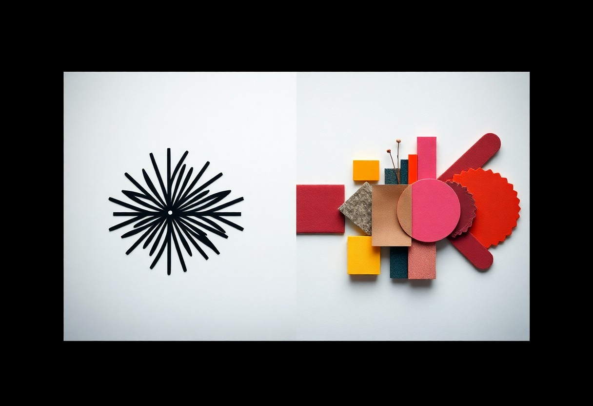
The Color Language: More Than Just Aesthetic Choices
Color serves as a powerful communicator in graphic design, influencing perceptions and decisions in profound ways. It transcends sheer beauty, operating as a vital language that conveys messages, establishes brand identities, and evokes specific emotional responses. Understanding this color language can elevate your designs, ensuring that every hue you select enhances the overall narrative and effectiveness of your work.
Emotional Resonance: How Color Evokes Feelings
Colors possess inherent emotional qualities, allowing you to evoke various feelings in your audience. Red ignites passion and urgency, while blue instills calmness and trust. By strategically leveraging these emotional associations, you can craft experiences that resonate deeply with viewers, bolstering the intended message and enriching the overall impact of your designs.
The Psychology of Color Combinations: Harmonies and Contrasts
Combining colors thoughtfully can establish visual harmony or create striking contrasts, impacting how designs are perceived. You harness color relationships, such as complementary or analogous schemes, to either unify your compositions or draw attention to key elements. These principles are instrumental in guiding viewers’ emotions and reactions, resulting in a more effective design.
Utilizing color combinations is both an art and a science. For instance, complementary colors like orange and blue can create a dynamic tension that captures attention, while analogous colors like green, blue, and teal promote a sense of serenity and cohesion. Applying the 60-30-10 rule—where 60% of a design is a dominant color, 30% a secondary color, and 10% an accent—can reinforce hierarchy and balance. By experimenting with varied combinations and considering the context, you enhance not only the aesthetic appeal but also the psychological effectiveness of your work.
Typography Matters: The Power of Fonts
Effective typography transforms your design, conveying messages and emotions through font choices. Every font tells a different story; it influences audience perception and engagement. Understanding the power of typography enables you to instill the right tone, whether you’re crafting a modern brand or a classic publication. Immersing yourself in the nuances of letterforms can elevate your design, ensuring it resonates with your target audience while remaining visually appealing.
Fonts That Speak: Choosing Typefaces for Purpose
Your choice of typeface should align with the brand’s identity and the message you intend to communicate. For instance, a bold sans-serif may convey strength and modernity, while a classic serif can evoke tradition and reliability. Selecting the right fonts not only aids recognition but also enhances emotional connection. Consider the context in which your design will appear, as well as cultural associations of specific typefaces, to ensure they resonate effectively with your audience.
The Balance of Readability and Style in Typography
Balancing readability and style in typography is crucial for successful design. An aesthetically appealing font can attract attention, but if it lacks legibility, your message risks being lost. Choose typefaces that enhance the user experience, ensuring your content remains accessible across various devices and formats. For example, according to research, around 68% of readers are likely to engage more deeply with well-designed, readable text. Prioritize straightforward fonts for body text while experimenting with unique styles for headings to maintain visual interest.
Finding the right balance between readability and style often involves testing different fonts in various contexts. Consider using contrasting font sizes, weights, and styles to create a hierarchy that guides the reader’s eye. Extravagant choices may attract interest but should not compromise legibility. Explore legible typefaces like Helvetica for body text, complemented by a bolder font like Futura for headlines. By harmonizing style and clarity, you ensure your designs are not only visually impactful but also communicative and user-friendly.
The Principle of Balance: Symmetry vs. Asymmetry
Balancing design elements creates harmony in your compositions, and understanding symmetry and asymmetry is key. Symmetry evokes a sense of order and stability, making it a popular choice in design for a classic and polished look. In contrast, asymmetrical designs inject energy and dynamism, making compositions feel more modern and alive. Knowing how to effectively use both can elevate your designs and engage your audience in unique ways.
Creating Stability: The Role of Symmetric Design
Symmetric design fosters a feeling of stability and calmness, often found in logos and branding. This approach pairs shapes and elements evenly, making it visually comforting. For instance, consider the timeless appeal of the Apple logo, which relies on symmetry to create a balanced, straightforward identity. By utilizing symmetry, you can reinforce trust and reliability in your design work.
Energizing Designs: The Impact of Asymmetry
Asymmetry captivates attention and generates excitement. It allows for more creative freedom, inviting viewers to explore your design. Bold uses of color, varying sizes, and unconventional layouts contribute to a sense of movement and urgency. Brands like Nike and Pepsi often employ asymmetrical elements to convey action and innovation, making their designs more memorable and engaging.
In practice, asymmetry can guide how your audience navigates your design, creating focal points that draw the eye. Consider using an off-center image or integrating an unexpected pop of color alongside other elements to forge intriguing contrasts. This approach not only maintains interest but can also lead to heightened emotional responses from viewers, effectively strengthening your message and brand’s identity. Analyze your design layout and strive for intentional imbalance to create a visual narrative that resonates with your audience.
The Importance of White Space: Breathing Room in Design
Effective use of white space, or negative space, is important in creating clarity and enhancing the overall design. It allows your content to breathe, guiding the viewer’s eye and improving readability. By strategically incorporating white space, you can highlight key elements while reducing visual clutter, making it easier for your audience to absorb information and engage with your visuals.
Clarity Through Simplicity: Enhancing User Experience
Emphasizing simplicity in design fosters clarity and enhances user experience significantly. By minimizing unnecessary elements, you allow your audience to focus on what truly matters—your message. Simple, uncluttered designs can boost user engagement, as they prevent overwhelming your audience and facilitate quicker comprehension of your content.
The Aesthetic Appeal: How Negative Space Enhances Composition
Negative space is not merely a void but a powerful compositional tool that elevates your design. Using it wisely creates visual interest, balances elements, and can even convey messages subtly. Designers like Apple excel by leveraging negative space, allowing their products to stand out against minimal backgrounds, ultimately creating iconic and memorable visuals.
The strategic placement of negative space can transform a cluttered design into an elegant composition. For instance, in logo design, brands like FedEx utilize negative space to incorporate hidden symbols, making their logos both memorable and meaningful. This technique invites viewers to investigate and engage more deeply, enhancing their overall experience with the brand. Such applications illustrate that negative space can evoke emotion and connection, proving instrumental in crafting effective communication.
To wrap up
Considering all points, employing timeless graphic design principles will elevate your work and ensure lasting appeal. By focusing on balance, contrast, alignment, repetition, and proximity, you enhance both aesthetics and functionality. As you apply these key concepts in your designs, you’ll create visual experiences that resonate with audiences for years. Keeping these principles in mind will not only improve your skills but also solidify your reputation as a designer committed to quality and clarity.